The branding for our 2020 Design For Good project for South Valley Services was an involved process with much research and care behind it. Our team had talked with SVS in our interview process about who they are, what they do, why their work matters, and what was most important to them. Later as a team, we talked about some concepts and ideas together, then Delaney our graphic designer ran with it. She took into consideration that an agency like SVS, that offers domestic violence services, should feel safe, welcoming, and hopeful — not dark, scary, or unapproachable.
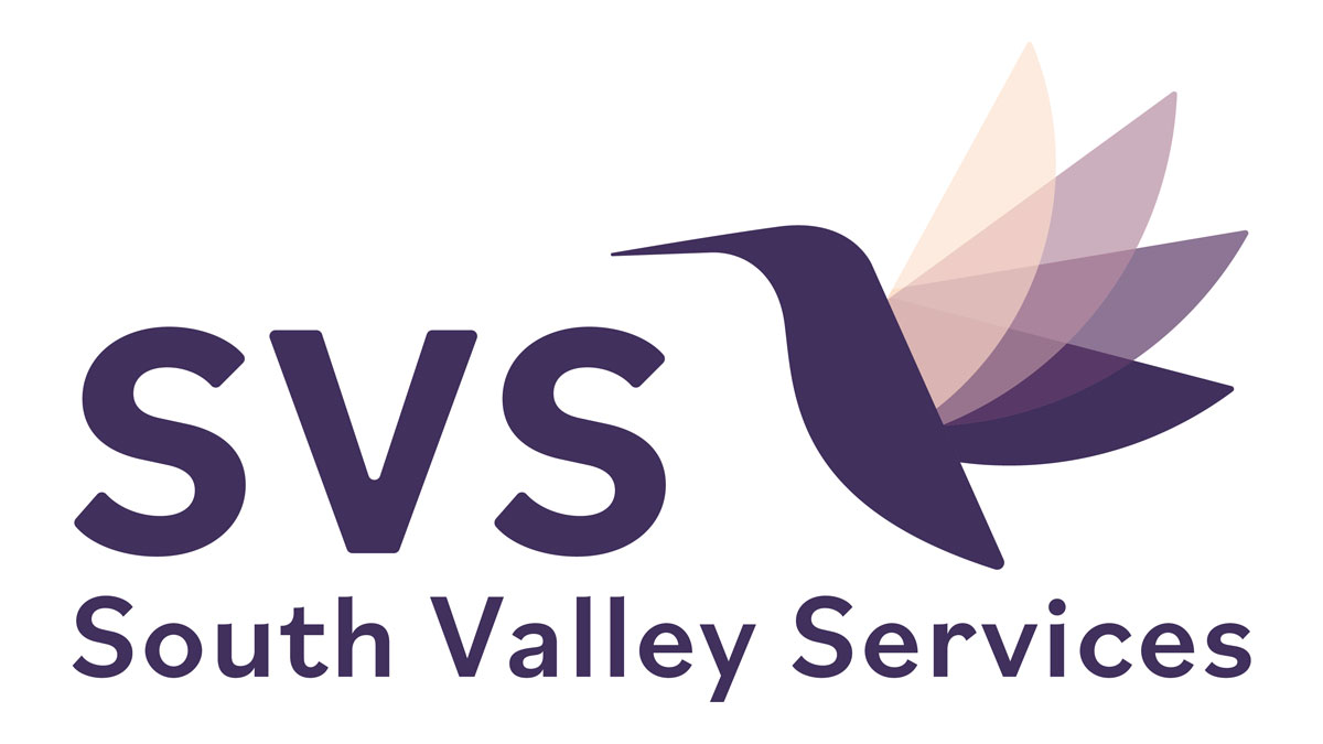
Delaney came up with 3 really beautiful concepts that all had subtle but meaningful details — like avoiding sharp edges and using rounded letters and shapes to give a feeling of safety and softness, and use of the color purple for domestic violence awareness. Though all 3 of her designs were top notch, our team’s favorite was the hummingbird and we were so happy when that was SVS’s top pick as well.
Some details from Delaney’s branding presentation, “Hummingbirds are native to Utah, and are a common sight all across the state. In many cultures, hummingbirds have long been portrayed as healers, light bringers, and helpers. They can fly up, down, backwards, and can change direction in an instant. They can go from stopped to full speed in the blink of an eye — representative of quickly taking flight and transcending unwanted circumstances. Their quickness shows the power of adaptability; being able to quickly shift into action as needed. They’re small, but incredibly talented and mighty. They drink the nectar of flowers and are always searching for the sweetness of life, and teach us to do the same.
The four wings in motion are representative of the four areas of the SVS mission: providing shelter, victim advocacy, case management, and prevention services. These overlap and blend together, creating humming-harmony of taking flight.”
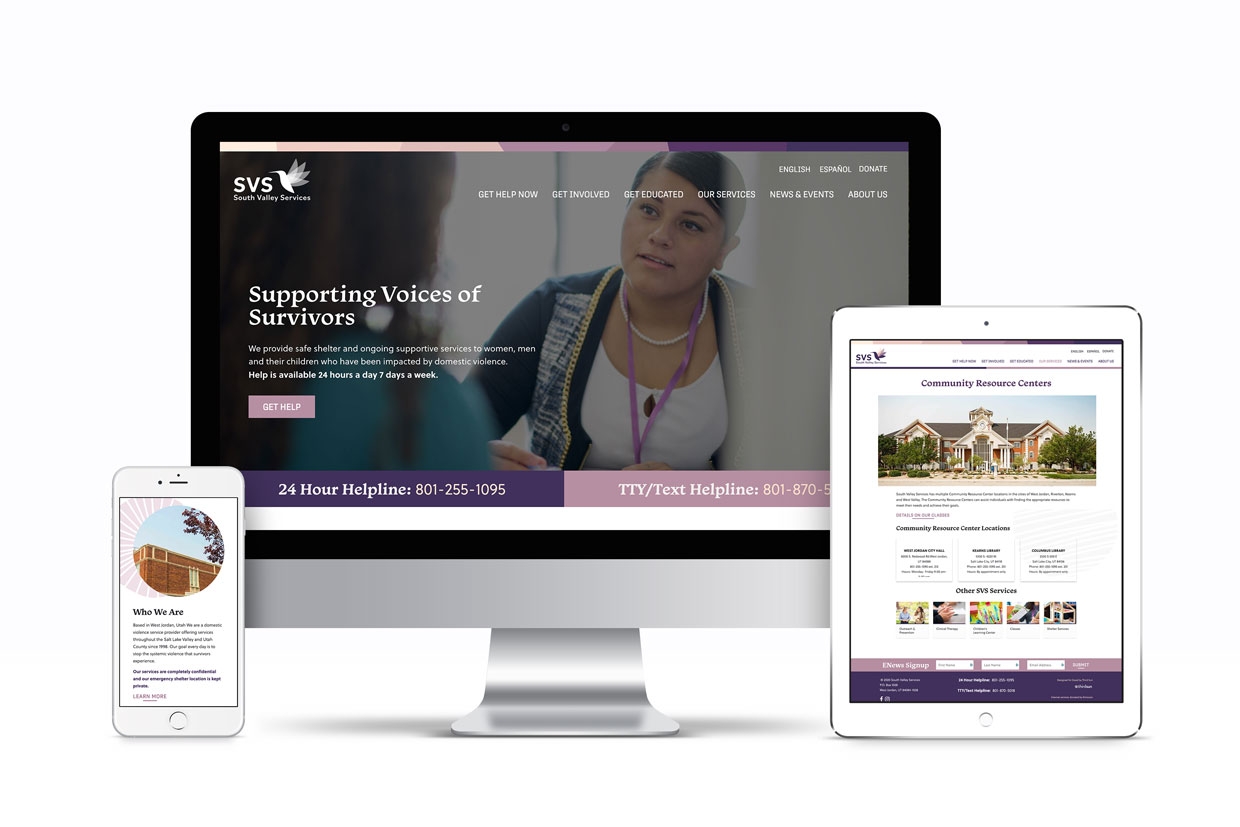
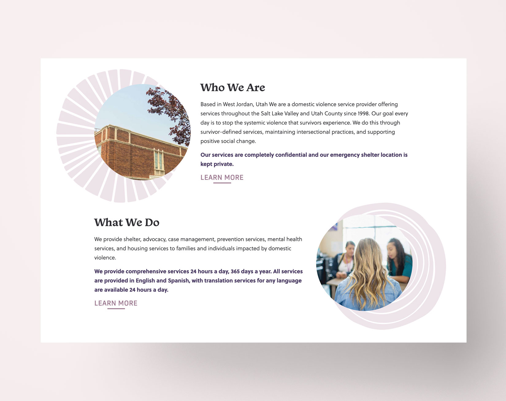
Once the branding was approved Delaney designed a corresponding layout for the new website, using the same serene color palette and an array of custom-illustrated rounded shapes to use throughout the site as watermarks and design elements. The shapes are rounded and soft, inspired by the sun, flowers, and organic elements to complement the hummingbird. They impart a sense of balance, embrace, and feeling whole.
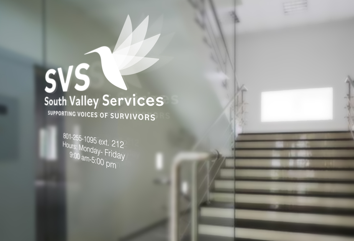
One comment on the branding from SVS mentioned that the hummingbird was an image they could envision on a door decal on one of their Community Resource Centers and that it would make their client feel like they had come to the right place. We took that feeling and carried it into the site, and we hope that the end result is a site that lets survivors know they are in the right place.