
Heck yeah you do! It looks awesome and you worked really hard on it.
Unfortunately, using fliers and PDFs online can make it difficult for some users to access your important information. This is especially true if you're using them in your hero section, blogs, or pop-ups. But don't fret! There are ways to make sure your content is accessible to all. For example, you can use smartslider components to add text and avoid using images with text overlays. This makes it easier for screen readers and translation tools to pick up on your content. Plus, it's more mobile-friendly and optimized for SEO. Who doesn't love that?
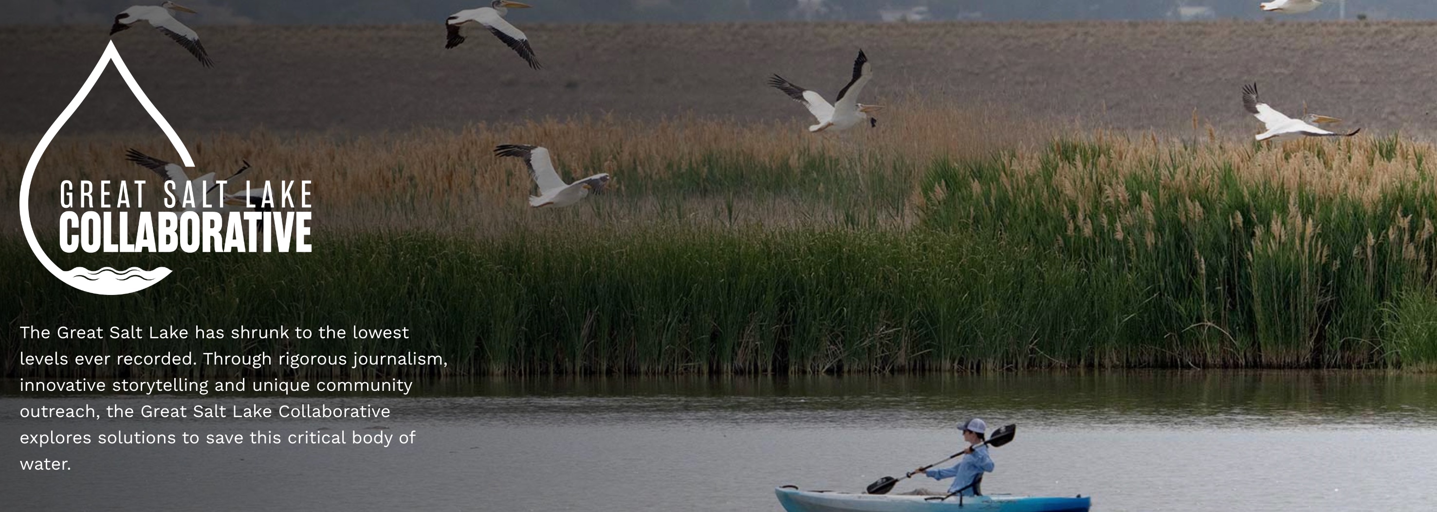
Here's a better example of a hero section:
Why's it so good?
- The image has a slight gradient filter on it allowing the text and logo to stand out on a darker background. This creates more contrast, thus making it more accessible!
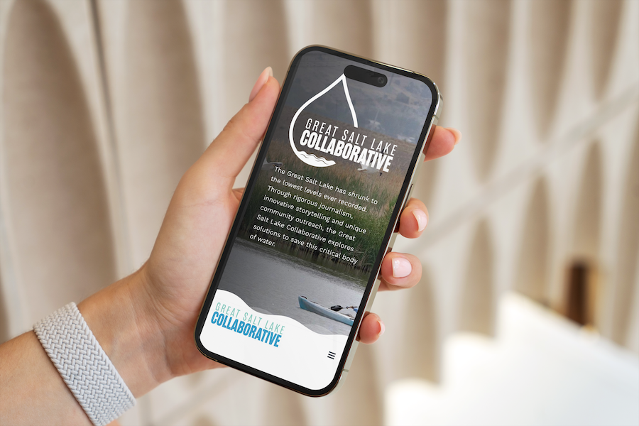
- There's written content that is not part of the image but is separate. Meaning it can adjust to browser width, and be seen by screen readers and SEO. It is readable to all types of users regardless of how they are able to consume the information. Check it out on a phone:
Here's a good example of a pop-up: 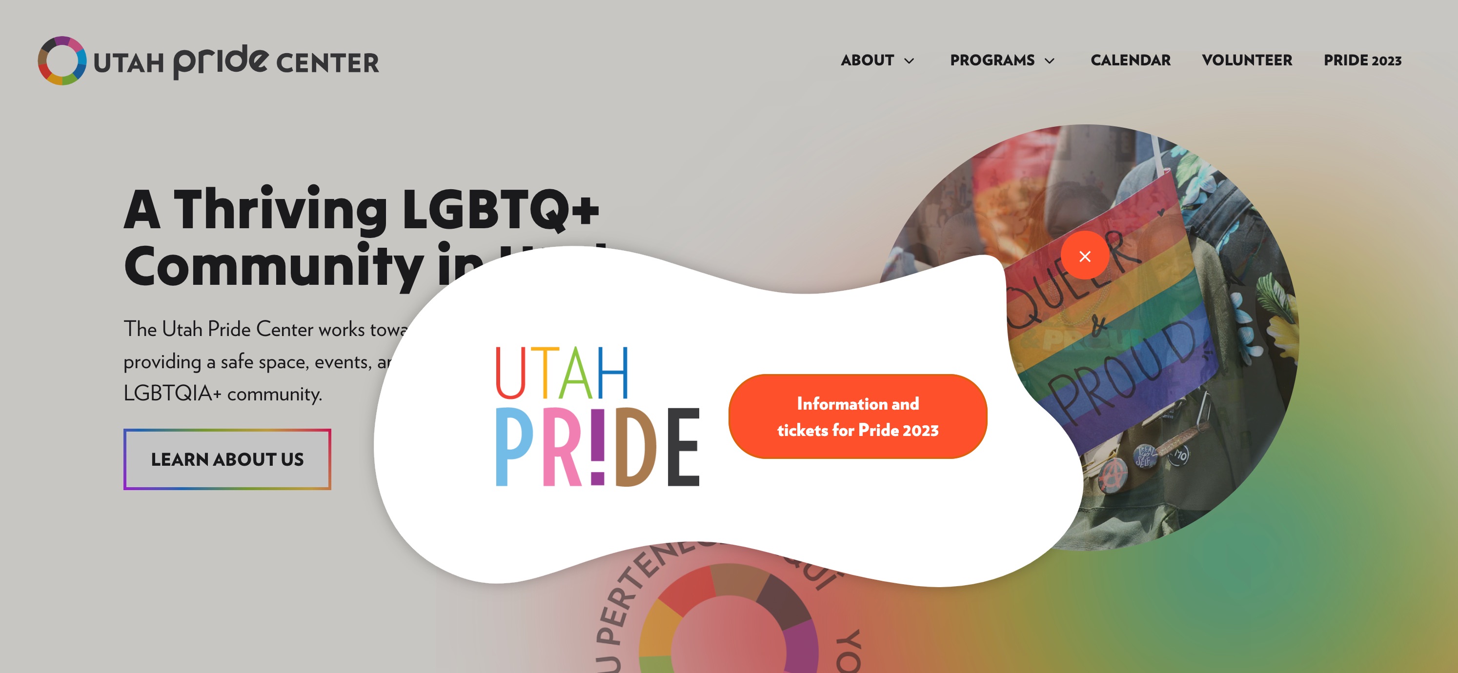
Why's it so good?
- It's simple: it leads with the Utah Pride Center logo which allows for an alt tag — something screen readers and SEO rely on heavily.
- There's a call to action with a button that opens in a new window.
- The pop-up doesn't rely on an image or a PDF to give impact. Instead, it utilizes EngageBox's fun templates and provides lots of contrast with a plain background and big, colorful exit button.
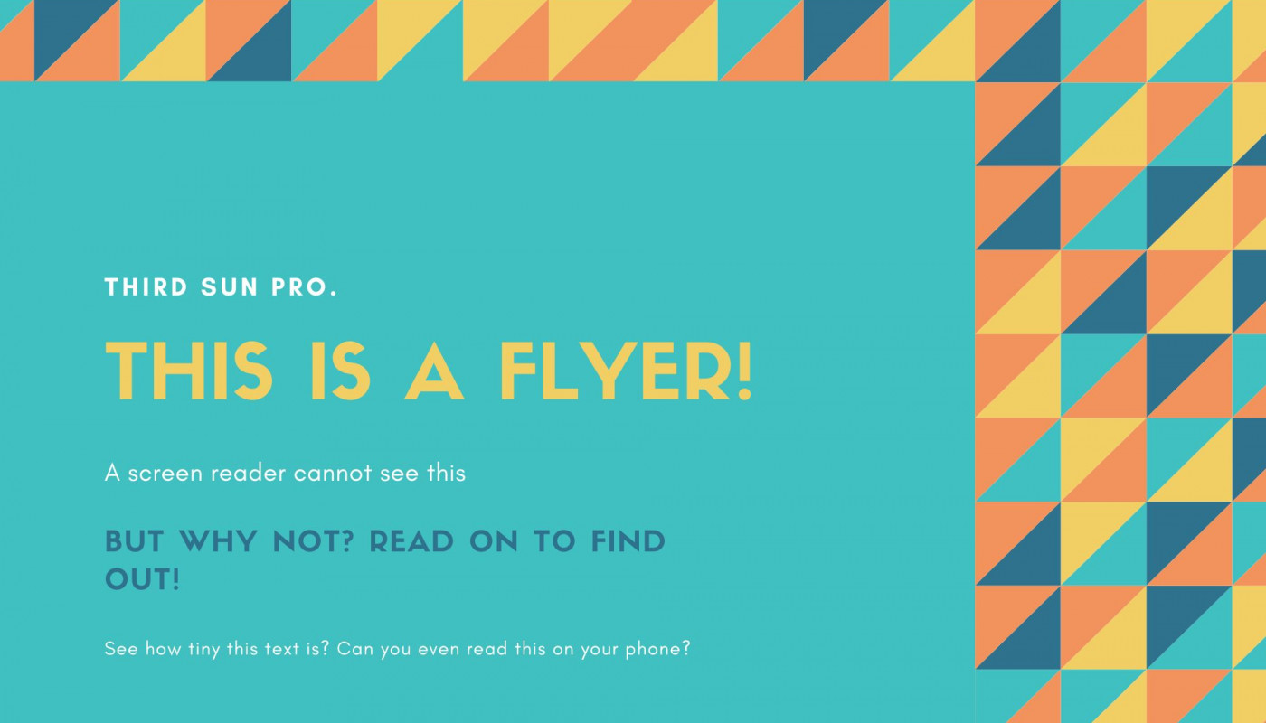
Here’s a great example of the worst flier ever and why it’s soooo bad.
Another example of a pretty dang bad flier:
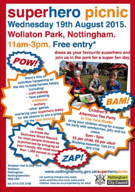
Why's it so bad?
- There are a lot of colors, shapes, and overlapping text which a screen reader would have a hugely difficult time with.
- All of this will get squished down quite small on a phone and be basically illegible.
- There's altogether too much information! It's not consumable for any type of user.
So, where can I use my flier?
We recommend sticking to print for this one. Coffee shops, light poles, and community gathering spots are great places to post them. Hand them out at your events and keep them in your facilities. That way, you can still get the word out without sacrificing accessibility and mobile responsiveness online.
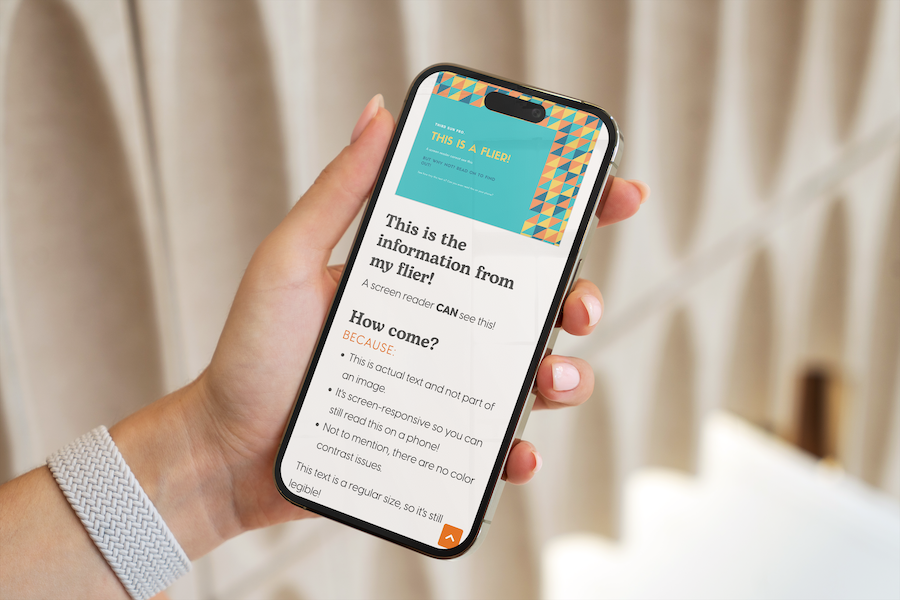
If you really want to use your flier on your website make sure you pull out the information on the flier into the content of the item or article.
In conclusion
We all have a responsibility to make the digital world a more accessible and inclusive place. By designing with accessibility in mind, you can ensure that your content reaches a wider audience and everyone can enjoy what you have to offer. Remember, accessible design is good design!